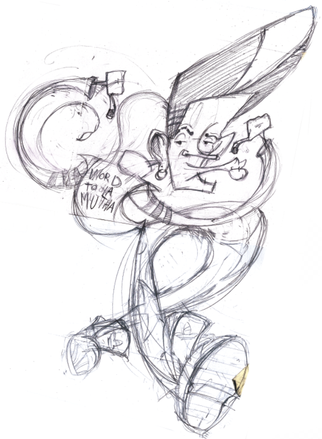
24 hours to make a poster that'll represent the image of an entire company's launch party. Sure, why not. Lion Pie is a Sydney based initiative developed by a group of fresh NIDA graduates. Its aim is to bring artists, actors, authors and industry professionals together to showcase their current projects. The poster needed to symbolise the 'work in progress' nature of the event as well as the young energy flying around when new ideas are being created. While being briefed over the phone, I scribbled a few brainstorms and notes. The call was conveniently made when I was just about to rush out the door, this is what it looks like with a nice acid yellow overlay.
I eventually figured that this could be the base of the final design. It's rushed, raw and puts my personal thoughts out there in a gutsy way, god I'm brave. But that's what Lion Pie is all about, being confident and biting off more than you can chew. So here's the final poster,
I wanted to maintain as many hand drawn elements as possible to maintain the rawness. It was also quicker to put together. So from the above design, everything else came more naturally, the invitation and the sponsor document. Luckily, I had an awesome client who was really clear about what she wanted but was open to interpretation. When she said she wanted the invitation text to look like it was stamped in a conveyor belt, I generally got what she meant.
The sponsorship document was slightly more corporate purely for readability reasons but still had the Lion Pie vibe about it. It was a simple double sided folded A4 document handed out to visitors and potential sponsors at the launch party. This was the first time I've seen people take my design home with them, a surreal experience but reaffirming.
Like the violin guy? :P Also, 6 pieces of my work were selected to actually exhibit at the event,
Overall, a hugely positive experience I won't soon forget. Massive thanks to the Lion Pie Crew for allowing me to be a part of it and putting together such a kickass launch party and to my cousin Kemal and his family for their hospitality and support. The Lion Pie website's definitely worth checking out
www.lionpie.com as is Kemal's t-shirt brand, Stunna Shade Boyz
http://www.facebook.com/pages/Stunna-Shade-Boyz
Peace.